1.
We all like surprises.
Can you state an
ordinary message in an unusual way? Not comedy, but differently, commercials
done this way are the ones we talk about for the next couple of days.
Stating
ordinary messages in a different or unusual way is important in advertising.
Sometimes comedy gets the message across, shock factor is effective, especially
the recent cigarette warning adverts on TV.
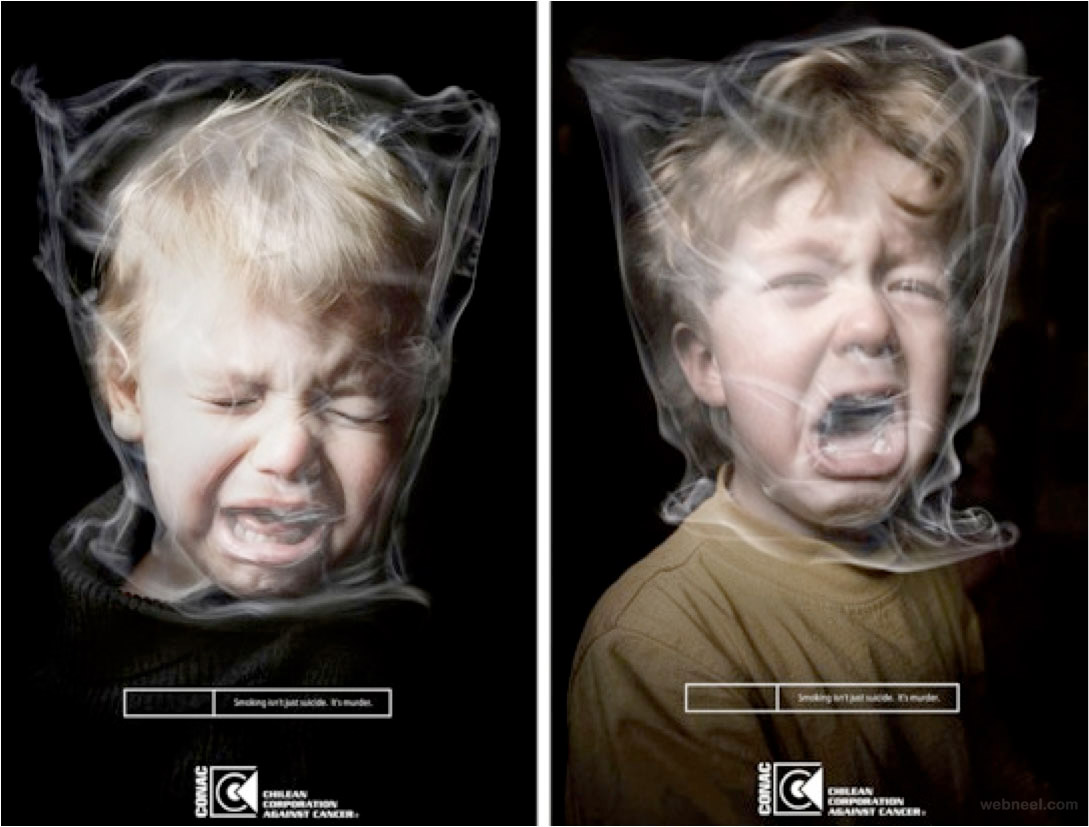
The
following advertisement is designed to coexist with TV adverts that are against
smoking in confined spaces containing children. This advert is a still image
showing smoke wreathing around a child's head, but manipulated in order to look
like a plastic bag suffocating the child.
It
is these kinds of images that we end up talking about for days on end.
Images like these stay in the mind. Hopefully, they get through to the
people the message is designed for, the target audience in this case is smoking
adults who have access to young children in confined spaces: usually this is
parents.
2. Keep it simple!
Don't let the
design overpower the message; the idea is the most important part of the
message.
Simplicity
is key in advertising; an advert has to be simple and effective so it doesn’t
take much time to digest the information. Something simple, and to the point
will always be more successful than an image that has lots of text and things
going on.
The
image below, for example is a still image, with a green background, two
figures, and a logo and text that states “make your own story”. This is a
reference to the Star Wars film when Obi wan Kenobi gives Luke Skywalker a
light sabre; he immediately points it at his face.
In the
film he’s unharmed, however in this instance, he has obviously chopped his own
head off. If this had happened in the film, then it would have been over, and
someone else would have had to save the universe, giving more purchase to the
idea of creating your own story. This advert is probably aimed at children or
people who like to create and make up their own stories.
3.
Get the audience involved!
Shock me, make me
mad, happy or sad, but don't bore me and leave me cold. Make something engaging
and you are instantly onto a winner.
Engaging
the audience is another key part of advertising, it being the main driving
force behind advertising. An engaging advert helps the consumer connect with
the product, keeps them thinking about it and makes them want to figure out
more about it, look further into it. It wants to hold their attention for a few
seconds longer than a normal advert would. For instance, the image below is of
the famous ‘Golden Arches’ that McDonald’s uses.
The
golden arches are world-renowned by now, with McDonald’s being found everywhere.
The Marketing department at McDonalds have to come up with a new way to show
off their brand all the time, and this is one of the ways they have done this.
It’s half of the arches, with text backwards so that when it’s reflected at
night, we find that McDonald’s is open all night, ready for people who are
hungry, work nights or are awake when the rest of the world is asleep.
The
target audience here is the late night crowd.
4.
Make me curious
Isn't the real
purpose of an ad to make me want more information? Grab the audience’s
attention and hold it.
Adverts sometimes
invoke curiosity, to get our attention and keep it. The longer they keep our
attention, the more likely we are to remember it; making the consumer want to
know more is key. This advert’s target audience is a bit ambiguous. We look and
then ask ‘What is this about?’ We have to look down, down, down across the
chest, the six-pack, down and across searching for anything that explains the
image. Finally, we see ‘Hair Removal’ on a tag at the bottom of the image.
Sex
sells. Does this image say to men: ‘Remove your body hair and you’ll look like
this.’ Or to women: ‘Get your man to remove his body hair and he’ll look like
this.” Or, does it say ‘Body hair is gross, remove it.’ This image is all about
body image and appearance. Very few adult males look like this, it takes time
and effort. Removing body hair is just part of this time and effort.
Ultimately, this advert could be a kick-start a viewer needs. One thing often
leads to another.
5. Great ads
command answers.
They demand you
respond to the ad, they are like an unanswered question that has to be
resolved.
An
advert is all about getting attention. Another way to do this is by commanding
answers, demanding a response; if it’s an emotional response, a logical one, no
matter what, it’s demanding a response.
For
instance, the advert below asks “Have you hugged your foot today?” This being
an almost nonsense sentence, makes the viewer think, and engage with the
advert. ‘How do I hug my foot?’ ‘Have I looked after my feet?’ ‘How do I look
after them?’ All these questions come to mind when posed with this advert.
Looking
closer, right at the bottom, we find it’s an advert for sports shoes that
reportedly, ‘stretches with your foot’. The dead giveaway is the NIKE tick logo
top right, but the image of the shoe is there to show the viewer what the
specific shoe looks like then when searching for it online or in a store, it is
easier to find. The design looks appealing too.
5.
They make you draw your own conclusions
Isn't the
strongest conclusion the one we draw ourselves? An ad that brings me to my own
conclusion is a powerful ad.
Adverts
that make you feel something more powerful and influential than normal,
something that really makes you emotionally connect with an image holds a
powerful position.
Lots of
adverts about life insurance, health and family try to connect with this
concept, but not many hit home properly. There is an advert For P&G that I
found when thinking about a target audience of everybody, about Mothers and
having the hardest job in the world.
The
advert shows children growing up and becoming athletes, all with their mother’s
support. This holds a powerful connection with almost everyone, because almost everyone
has experienced having a mother.
The
advert is supported by P&G, who own a whole bunch of brands that mothers
and care-givers use, cleaning products, baby products etc.
7. The headline
and image tell the story.
The headline
should never tell you what is in the picture, only what you don't see, the
headline and picture together create the story.
The text
on an advert is just as important to the advert as the image is. While the image
needs to be attention capturing, interesting and relevant, the text has to tell
you what the image doesn’t. It has to justify the rest of the image, creating
context for something that wouldn’t make sense otherwise. For instance, the
image below has a giant pearl earring hanging from a woman’s ear. Now normally,
without the text this could be seen as an advert for a number of different
things, Jewelry, body modification, a book or film, but when you add the text,
explaining that this is an example of how big pearls can actually be, and that
it’s for a museum that explains science, the entire image has a better context
and makes more sense.
8. They never brag
Yellowstone
Harley Davidson in Belgrade, Montana, with a population of 3,000-4,000 has a
billboard on the edge of town, proclaiming "the largest Harley Davidson
dealer in Belgrade!"
They are
not only the only dealer in Belgrade; they are the only one in over a hundred
miles, just a fact. Not brag.
9. They are ALWAYS
well executed.
They have a good
design that doesn't overpower the message.
The
final step to making a good advertisement is to be well executed, bundle
everything together and package it so that the largest group of people possible
can be affected by it, moved by it and intrigued by it. The design, composition
and text, don’t overpower the image, but enhance it. The well execution of an
advert is the hardest part of the entire process. And if you get it right, you
nail the advert.


