Friday, 26 June 2015

Cultural Context of my images

Upwardly mobile, professional people, mainly males who tend not to cook so much for themselves, but may be persuaded by using 'cool' looking knives. 

Young professional males often have disposable income and so going out in the evening and playing pub games particularly pub games, darts and pool, is part of their everyday culture. 

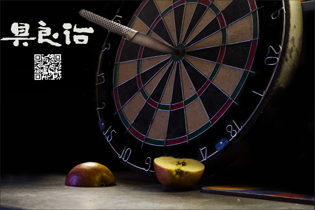
in this instance, I decided after my mother decided I should learn to cook that placing these knives, which are actually very expensive, in the realm of upwardly mobile professional males in an effort to persuade or encourage them to learn to chop fresh food and cook it for themselves, if they had the correct tools to do so. I thought that using a dart board to show precision, because that's how these knives are designed and purposed towards, that it would visually project that better than just having a flat image of the knives, with text on the image stating they are. 

The entire point of the lack of text is to generate intrigue, make people want to learn more about the knives, which is why the image grabs the audience's attention and provides the information through a QR code.

Placing adverts in 'higher class' parts of a city or even near bars and clubs are probably the best locations for my adverts. 


Wednesday, 24 June 2015

This idea began with the question "What do global knives represent?" and the answer is professional precision in the consumers hands.

Knives made to an industry standard available to the public. 

I then started to try and answer the question, "what do i feel represents precision?" and i got thinking about sports that require precision, and sharp objects, and that's when i landed on darts. 

Darts is all about precision. 

From there it was how can i link darts and the kitchen, and that's how the fruit got linked to the project, adding food into it, bring the person back to using the knives in a relevant environment.


The idea of using a QR code was to further engage the audience, to drag them into the image and make them inquire more into the campaign. 

Tuesday, 23 June 2015

ASA : Banned Adverts


(taken from: http://www.huffingtonpost.co.uk/2015/02/25/kazam-worlds-slimmest-phone-advert-banned_n_6752776.html on 23/06/2015)

There are always some adverts that go too far, that can be sexist, racist, homophobic or just insensitive. the rules and regulations for these adverts can be found here at: https://www.gov.uk/marketing-advertising-law/overview

This website talks specifically about what you can and cannot show when it comes to advertising. 


These adverts are usually banned and removed from being shown, but, in todays society nothing is ever completely deleted or removed. 
Here are some more examples of other banned adverts. 

This was banned because it was seen as sexualising schoolgirls, who are usually underage.


This was banned because it was seen as racist.

These images were both banned because they were seen as misleading and slanderous. 


Monday, 8 June 2015

Conclusion

I really enjoyed this project, the concept was interesting and the execution was fun, if i had could change something, i would probably have provided more images and provided them to a higher standard. (and maybe even spent less time editing them)

The development of this brief was a pretty steep learning curve, i didn't feel like i did enough of it, but what i did learn, and develop was the worth of not over-editing my photographs. That less is often more, and that i could spend more time writing, and documenting my work.

I enjoyed this project, when it all comes down to it, the shoot was fun, the planning was minimal and the images turned out really well, the use of QR codes and the text make the image just intriguing enough to pull people in, and look harder at.

Final Images